Search
Color
Inputs come in two different colors. The default input color is $field-01 and
is used on $ui-background and $ui-02 page backgrounds. The --light version
input color is $field-02 and is used on $ui-01 page backgrounds.
| Element | Property | Color token |
|---|---|---|
| Field | background-color | $field * |
| border-bottom | $border-strong * | |
| Field text | text color | $text-primary |
| Prompt text | text color | $text-placeholder |
| Icon | fill | $icon-secondary |
* Denotes a contextual color token that will change values based on the layer it is placed on.

Example of Search using $field
Interactive colors
| Element | Property | Color token |
|---|---|---|
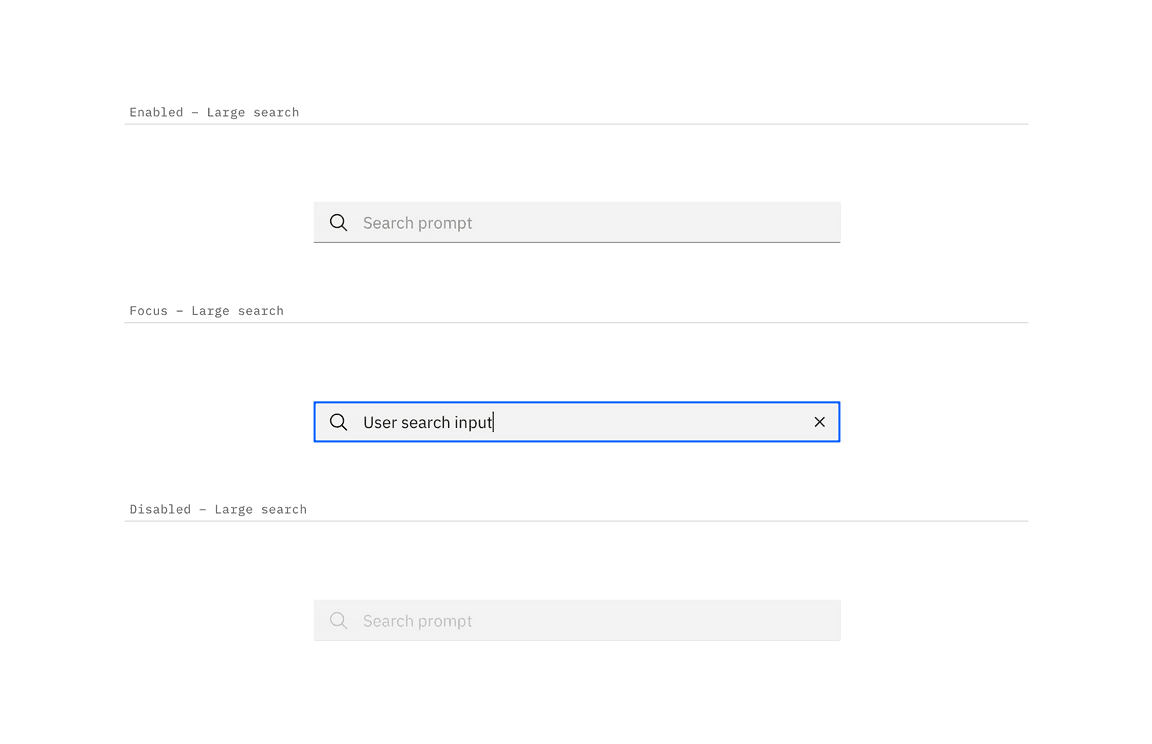
| Input:focus | border | $focus |
| Field:disabled | background-color | $field * |
| border-bottom | transparent | |
| Field text:disabled | text color | $text-disabled |
| Icon:disabled | fill | $icon-disabled |

Examples of enabled, focus, and disabled search states
Typography
Search text should be set in sentence case, with only the first letter of the first word capitalized.
| Element | Font-size (px/rem) | Font-weight | Type token |
|---|---|---|---|
| Field text | 14 / 0.875 | Regular / 400 | $body-compact-01 |
Structure
The width of the search field should appropriately fit the design and layout of content.
| Element | Property | px / rem | Spacing token |
|---|---|---|---|
| Search icon Close icon | height, width | 16 / 1 | – |
| Large field | padding-left, padding-right | 48 / 3 | $spacing-09 |
| Small field | padding-left, padding-right | 32 / 2 | $spacing-07 |

Structure and spacing measurements for large search | px | rem

Structure and spacing measurements for small search | px | rem
Sizes
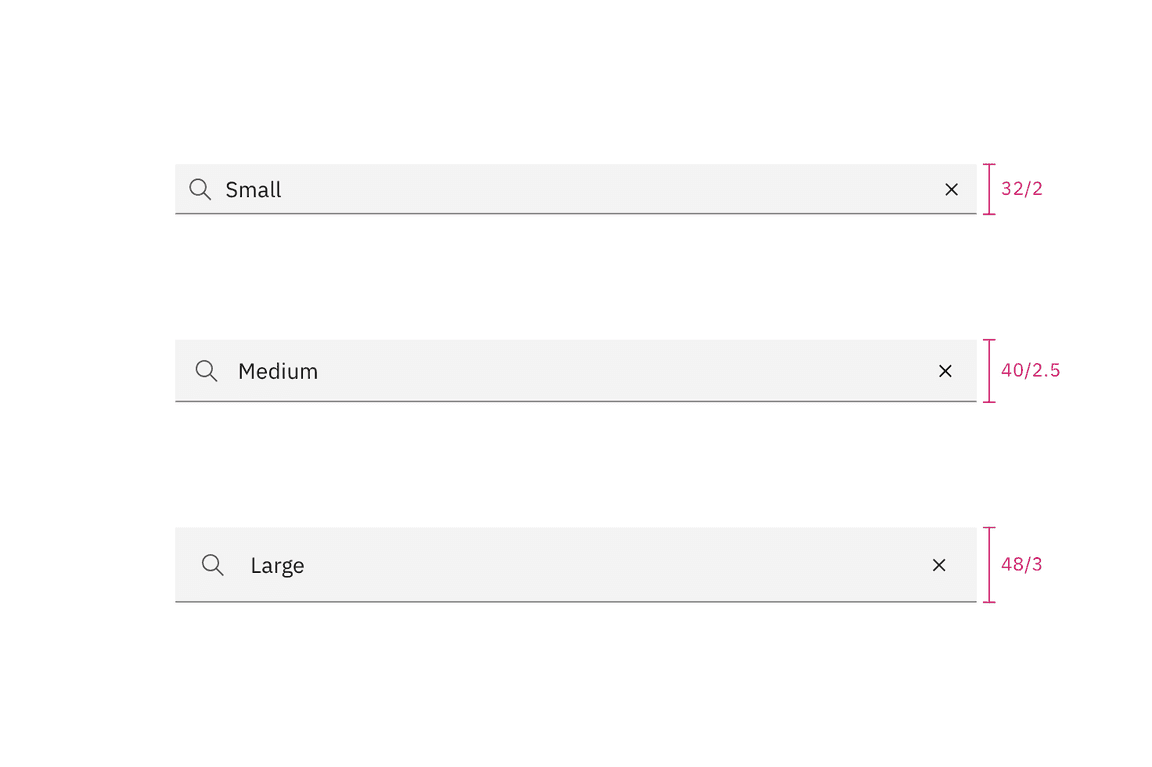
| Size | Height px / rem |
|---|---|
| Small (sm) | 32 / 2 |
| Medium (md) | 40 / 2.5 |
| Large (lg) | 48 / 3 |

Search sizes | px / rem